Illustration and Visual Narrative / Task 1
27/08/2021 - 24/09/2021 / Week 1 - Week 5
Nurul Adlina Rizal / 0345429 / Bachelor of Design in Creative Media
Illustration and Visual Narrative
Task 1: Exercises
LECTURES
Week 1: Introductory class to IVN and what we have to prepare. Ms
Anis and Ms Jennifer briefed us about the first Exercise - the Vormator
Challenge.
Week 2:
Introduction to Character Design
Principles of Character Design
1. Shapes
- defines a character's silhouette
- used to identify a character from one another.
- sets the ICONIC LOOK !
- explore !
2. Colour
- determines who are the heroes/protagonist or villains/antagonists
- different choices of colors also give an impression on a character
- colors can cause certain emotions in people (Color
Psychology)
3. Emphasis & Contrast
- pick one visual element in a character and exaggerate it, making the
character outstanding and memorable
4. Harmony
- all shapes, lines, colour, motifs, patterns must be put together in a
tasteful manner.
- every element used in the design must work together / compliment each
other
- balance of visual elements that has visual hierarchy
5. Expressions/Poses
- win the heart of an audience with their behavior/quirks/personalities
that are visually shown
- that way, you don't need to tell them, your audience can
interpret them
Week 3:
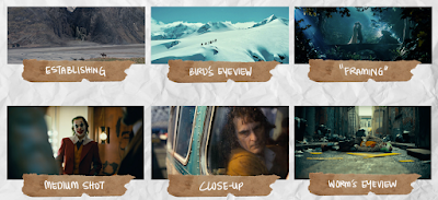
Visual Techniques: Composition (1)
Types of Shots/Compositions
- Establishing
- Bird's Eyeview
- "Framing"
- Medium Shot
- Close-Up
- Worm's Eyeview
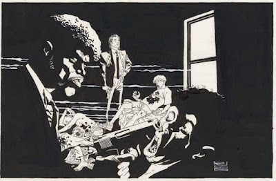
Composition Rule No. 1
- A balanced distribution of Positive Vs Negative Spaces !
Fig 1.4: Balance in Positive and Negative Spaces (10/9/2021)
There is no Right or Wrong in composition. Only Bad / Tasteful composition.
Six Compositions with Jazza
What is composition?
Composition essentially refers to how your image is put
together.
The Rule of Thirds
A guideline artists use to compose imagery, the aim being to ensure a
piece is visually appealing and balanced.
Top Left : Primary
Bottom Right : Secondary
- communicate a sense of scale to the viewer
Create Environment Art
- establish depth
- using a dramatic shift or change of aspects the visuals to guide the
viewer's eyes through the piece
Detail
- pick between one to three areas of interest and freely add details to
those areas
- depth of field in cinematography, where focal points are sharp detail and
everything else is slightly blurred
Symmetry vs Asymmetry
- human brain likes symmetry
- keep your design symmetrical for an aesthetically pleasing piece
- asymmetrical image can be a useful way to add drama
Week 4:
Visual Techniques: Composition (2)
Perspectives
Paintings before the 14th century had no attempt in creating the illusion
of depth and space until Fillipo the Architect came along.
Perspective in Art
- to create depth / a sense of space
- an illusion
- from a 2D surface to create a 3D optical illusion
Types of Perspectives
- 1 Point
- The point, where all the lines converge, are reffered to as the
vanishing point
- the closer an object is to the VP the smaller they become until they
vanish !
- 2 Point
- two vanishing points on either side of the horizon
- draw your grid lines emerging from your VP
- 3 Point
- two VP on opposite sides of a horizon with the additon of another VP high
above or below the horizon
- useful to achieve a sense of drama and scale
- looking down / looking up at something
- 4-5 Point (Fisheye)
"Parallex Effect"
- use layers to depict depth
- mimic 3 dimensions
INSTRUCTIONS
Task 1: Exercise 1 - Vormator Challenge
We are tasked to design one character by using the given sets of
shapes.
With these 8 shapes I brainstormed of many different ideas. What I mainly
wanted to do was an adorable character that has a lengthy and deep
backstory.
I set my eyes on creating a ghost/spirit type of character since I liked
the idea and had an interesting story surrounding the character. However, I
did try to experiment on making humanoid characters such as in Fig 2.2, I
wanted to make a whole different type of character. I attempted these
sketches on Adobe Illustrator since it was very hard for me to visualize the
shapes together unless I try it out.
Fig 2.3: Exercise 1 Digitalized Black & White #1 (3/9/2021)
Fig 2.4: Exercise 1 Digitalized Black & White #2 (3/9/2021)
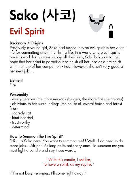
For a deeper description:
Fig 2.5: Sako description (3/9/2021)
I clearly thought a lot about her story and the world she lives in. (best
part of character design to be honest)
Next, I had to find a color palette for her. This process was a little
difficult because I made three different versions of Sako and it became
harder to choose the best one. I need to learn more about color theory and
how to apply it to character design because I did not want to experience
the same amount of struggle as I did.
The three colored versions of Sako:
Fig 2.6: Sako colored #1 (10/9/2021)
Fig 2.7: Sako colored #2 (10/9/2021)
Fig 2.8: Sako colored #3 (10/9/2021)
Figure 2.7 may be my most favorite and the most visually interesting one. Figure 2.6 is the initial color palette plan that I had for Sako, and now it looks like her goth version. The last one on Fig 2.8 was my attempt on having a more pastel cute color palette for Sako. It looks okay but it is a little dull and plain.
Chosen Color Palette
Fig 2.9: Chosen Color Palette (10/9/2021)
The color palette in Fig 2.9 was put together in Adobe Color.
Final
RATIONALE
For Exercise 1, I was able to apply what I learned during the lectures on
character design such as creating a silhouette for my character which can
showcase its personality. A rounded character with soft edges like mine
showed that Sako is not a terrifying character (despite being a spirit)
and has a soft and kind personality.
In this design, the principles that exist are balance, harmony and
unity.
Task 1: Exercise 2 - Vector Illustration
For Exercise 2, we are tasked to make a game card for the character
designed in Exercise 1. Since I never designed a game card before, I set out
to find inspirations and ideas.
Inspirations
Fig 3.1: Inspiration #1 (17/9/2021)
Fig 3.2: Inspiration #2 (17/9/2021)
Sketches
In Fig 3.3, the background is a haunted house to give a creepy feeling to
fit Sako being an evil spirit that occupies these abandoned places. It was
difficult to organize information, I did not know whether to fit in her
backstory or game stats.
In Fig 3.4, it is to show the agency that Sako works for the one that helps
human hire spirits to do tasks for them that only the paranormal can. It is
called the Evil Agency or previously Evil Co. and the back of the card is
its logo.
Drafts
Front Design
Fig 3.5: Front Draft #1 (17/9/2021)
Fig 3.6: Front Draft #2 (17/9/2021)
Chosen Color Palette
Found this color pallete online when I was searching for dark color
palettes. I used this for the background of the card's scenery instead of
keeping it grayscale.
Based on the chosen color palette I designed my third draft in Adobe
Illustrator. It is different from Draft #1 and Draft #2's ideas because I
wanted to try a tarot card design that emphasizes the character
more.

|
| Fig 3.9: Front Draft #4 (23/9/2021) |
Back Design

|
| Fig 4.0: Back Draft #1 (23/9/2021) |
Final

|
| Fig 4.1: Exercise 2 Final Front Card (24/9/2021) |

|
| Fig 4.2: Exercise 2 Final Back Card (24/9/2021) |
RATIONALE
For the Final, I removed the elements from the last draft that I found
were too distracting and took the focus away from the character such as
the clouds in the background and the red section at the bottom. I also
tried to make Sako pop out by adding a shadow behind her. For the back
part of the design, since it look too plain, I added a pattern at the
border that I was inspired by the pattern on leather made items. It is
also to symbolize how professional Evil Co. is.
In this Exercise, I learned and utilized the design principle - emphasis
and contrast - to make sure my Vormator character stood out. Since Sako
was bright in color, her dark background not only showcases the
background of the world she lives in but also contrasts well with her
color palette. I have also used utilized information hierarchy by having
the name of the character be in larger text compared to the other less
important information. Overall, the Exercises were enjoyable and I
developed many skills and comfortability in using Adobe Illustrator
while gaining experience as a designer.
FEEDBACKS
Week 1
General Feedback: Give story and a name to your characters!
Week 2
General Feedback: Try to use gradient for color. Make sure the
expression/pose of the character fits the personality/story behind the
character.
Week 3
General Feedback: For the layout/background design, attempt to
do it in black and white first. This is to make sure you have a good
composition.
Week 4
General Feedback: Remember that the submission should be
600 px x 600 px for Exercise 1 and 897 px x 1479 px for Exercise
2.
Week 5
General Feedback: -
REFLECTIONS
Experience
There were so many fun experiences for this module not only in class with
Ms Anis and Ms Jennifer but also during the process of designing my
character and game card. Classes were enjoyable with fun banter thrown
around and Ms Anis' cat always up to no good. There would never be a dull
moment during an IVN class.
Next, during my process, I had a good time designing characters and the
game card because I felt like I was in my element and doing something I
truly enjoyed. I had so many ideas flowing into my brain when I got into the
groove of using Adobe Illustrator. It is definitely one of the memorable
projects I have done in my life.
Observation
One thing that I observed while designing characters was that adorable
tiny characters can be easy to make yet very hard to make it interesting and
draw attention. I also observed that I have a hard time understanding color
palettes and how colors work together despite learning color theory before.
Adobe Color really helped me in lot in that aspect. A strength that I want
to take note of is my ability to absorb knowledge from lectures and
practical class and integrate them into my design. I also think that I am
good at world building and making a story for even the simplest of
characters.
Findings
Colors are hard. I struggled on this for both Exercise 1 and 2. From this
issue that I realized I have, I know that I should learn how to compile
colors together and how to apply them on the designs I make to create
visual interest. For example, colors that can emphasize a point and
characteristics of a character. Next, I learned a lot during my lectures and practical classes. Ms Jennifer
demos and calm music certainly made the learning process easier and I learn
how to use many different tools in Adobe Illustrator.
To strengthen my weakness, I should do more studies on color so I can be
more natural in design and not struggle or stuck at choosing color
palettes.


Comments
Post a Comment