Typography / Task 2

Nurul Adlina Rizal / 0345429 / Bachelor of Design in Creative Media
Typography
Task 2: Typographic Exploration & Communication
LECTURES
Lectures 1-5 completed in
Task 1
Week 6:
Typo_6_Screen & Print
Different Medium
- Type was only viewed as living only when it reached paper
- today, it exists not only on paper but on multitude of screens
Print Type vs Screen Type
Type for Print
- existed long before we read from screen
- a designer's job to ensure that the text is smooth, flowing and
pleasant to read
- good typefaces for print - Caslon, Garamond, Baskerville
- elegant and intellectual but also highly readable when set at small
font size
- versatile
Type for Screen
- typefaces intended for use on the web are optimized and often
modified to enhance readability and performance onscreen
- can include taller x-height, wider letterforms, reduced stroke,
contrast more open spacing
- fonts made for screens = Georgia
Hyperactive Link / Hyperlink
- a word, phrase or image that you can click on to jump to a new
document / new section within the current document
Font Size for Screen
- 16 px text on screen is about the same size as text printed in a
book or magazine
System Fonts for Screen / Web Safe Fonts
- each device comes with its own pre-installed font selection
- 'Web Safe' fonts appear across all operating systems
- ex: Open Sans, Lato, Helvetica, Times New Roman, Georgia, Garamond
Pixel Differential Between Devices
- the text seen on screen on our PCs, tablets, phones and TVs differs
in proportion because they have different sized pixels
- 100 pixels on laptop is very different from 100 pixels on a big 60"
HDTV
Static vs Motion
Static
- minimal characteristics in expressing words
Motion Typography
- bring it to life through animation
- motion graphics, particularly the brand identities of film and
television production contain animated type
- follow rhythm of soundtrack
INSTRUCTIONS
Task 2: Typographic Exploration & Communication
Visual Research
What is Manifesto 2000?
When reading about it, it lead me to its main website:
The website itself has a clean design to it, making me inspired to try
the same for the editorial spread as a tribute to it. The font was also
very iconic to the website and Manifesto 2000. However, I do believe out
of the 10 typefaces there were no similar ones. The closest was Serifa Std
but I did not like the width of its letters so I decide to continue with
sans serif typefaces such as Univers LT Std and Futura Std.

|
| Fig 1.0: First Things First typeface (1/10/2021) |

|
| Fig 1.1: First Things First page (1/10/2021) |
Idea Exploration
Sketches

|
|
Fig 1.2: Layout Sketches (28/9/2021) |

|
|
Fig 1.3: Headline Sketches (28/9/2021) |
I had many ideas for the Layout but chose only a few to move forward
with.
For the type expression, I focused on the word 'Unite' to emphasize and
express for this editorial spread. It is also what I believe to be the main
message of the article, how these visual communicators unite to make
Manifesto 2020.

|
|
Fig 1.4: Progress (22/9/2021) |
Making sure I use the things learnt in the previous exercise which is
baseline grids and cross-alignment.
Drafts
- Layout 1

|
| Fig 1.5: Layout 1 Version 1 (28/9/2021) |

|
| Fig 1.6: Layout 1 Version 2 (28/9/2021) |
I used text bubble as graphics to show that the article is calling out
to the reader and starting conversations about the future of visual
communicators.
- Layout 2
Type Expressions

|
| Fig 1.7: Type Expression #1 (28/9/2021) |

|
| Fig 1.8: Type Expression #2 (28/9/2021) |

|
| Fig 1.9: Type Expression #3 (28/9/2021) |
I tried three different type expressions for the word Unite for Layout
2.
Layout
|
| Fig 2.0: Version 1 (28/9/2021) |

|
| Fig 2.1: Version 2 (28/9/2021) |
-
Layout 3 & 4
Based on the feedback given by Mr Vinod during Week 6, I decided to
work on the type expression again to make sure my headline is good. I
want it to be eye catching and portray the feeling of the word 'Unite'
well.
Type Expressions

|
| Fig 2.2: Type Expression #4 (5/10/2021) |
I tried using the Futura Std. font for the word 'Unite' but they felt more detached and separated rather than united so I tried out a different font - Univers LT Std.

|
| Fig 2.3: Type Expression #4 (5/10/2021) |
I made a version with black background to match the aesthetics of the original website about Manifesto 2000.
Layout 3

|
| Fig 2.4: Layout 3 Sketch (5/10/2021) |

|
| Fig 2.5: Layout 3 (5/10/2021) |
White Background Version

|
| Fig 2.6: Layout 3 White Version (5/10/2021) |
Used the design of the exclamation mark to be a reoccurring graphic in
the layout.
Layout 4

|
| Fig 2.7: Layout 4 Version 1 (5/10/2021) |
|
| Fig 2.8: Layout 4 Version 2 (5/10/2021) |
Fonts: Univers LT Std (Roman, Black Extended) and Futura Std
(Heavy)
Point Size: 9 pt (body text), 20 pt (subheading)
Leading: 11 pt (body text), 22 pt (subheading)
Paragraph Spacing: 11 pt (body text), 22 pt (subheading)
Line Length: 60 characters max (body text)
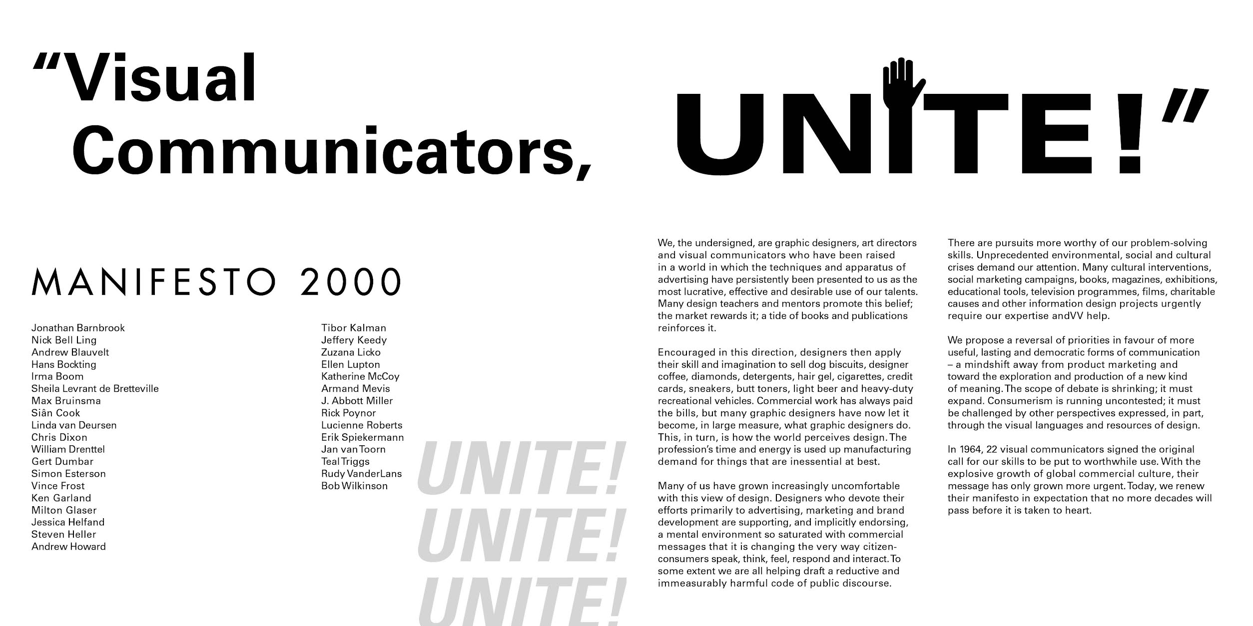
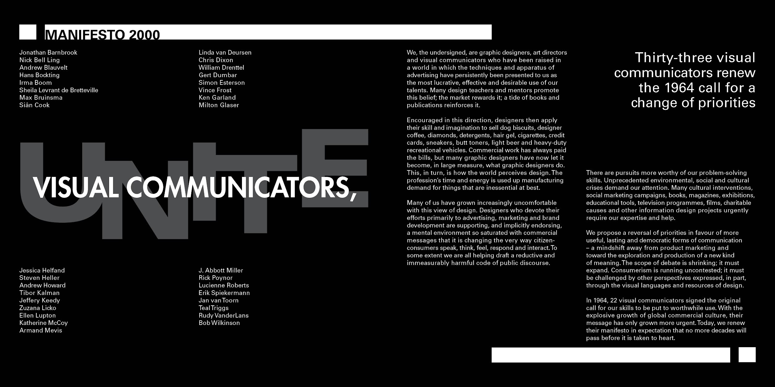
For the final, I decided that I like Layout 3 the most.
Final
Task 2: Typographic Exploration & Communication

|
| Fig 2.9: Task 2 Final in JPEG (5/10/2021) |
Fig 3.0: Task 2 Final in PDF (5/10/2021)
FEEDBACKS
Week 6
General Feedback: Focus on the expression of your headline first
before planning on your layout.
Week 7
General Feedback: Make sure your idea is able to integrate with the rest of your layout.
The headlines, subtext and body text should look like they are connected.
For the e-portfolio, we should not forget to do your labelling and further
reading.
REFLECTIONS
Experience
Regarding this Task, we only had one class to discuss about the work. It
was a fruitful class because we managed to give everyone that sent in their
work in the Facebook post some valuable feedback. It was a little awkward to
have your own peers give feedback to your work but I think it helped us all
grow as designers and also how people around us - that are knowledgeable of
design - would comment and perceive our work.
During the making of Task 2, I struggled a lot in the Type Expression part
of the task. It was very difficult for me to brainstorm ideas on the title
'Visual Communicators, Unite!'. Eventually, I did get to a point where I was
satisfied with my idea explorations for the headline to finally work on the
layout. I still feel that I have so much more to grow and learn.
Observation
Coming into this project, I was a little discouraged by the lack of skill
that I had in Typography. From Task 1, I learned a lot to help me for Task 2
but I also was too hung up on the things I could not do well. I think it is
important to look at your strengths and weakness during these times so that
you can keep moving forward. I do have a tendency to look on my past
mistakes and letting it bring me down.
A strength that I discovered through this task however was my tenacity.
Even when I was discouraged at the start, I took the extra time to look at
Editorial Spreads and research more about it so I can hopefully, produce a
good final.
Findings
Thanks to the feedbacks I believe that it helped me understand things that
make a layout look good and fulfill its purpose. As a person, I learned to
absorb feedback in a positive way rather than taking it personally. It is
good to have any sort of feedback for your work to keep you improving and
understand the flaws that you may have in your work. I also learned that the
mistakes you do now does not define you as long as you keep wanting to get
better.
Lastly, for the layout part, although time consuming, taught me about the
importance of details in layout such as kerning, ragging, cross-alignment
and the typeface used to express the idea of the article.
FURTHER READING
The Vignelli Canon by Massimo Vigenelli

|
| Fig 3.1: Cover of The Vignelli Canon (5/10/2021) |
Reference: Vignelli, M. (2010). The Vignelli Canon. Lars
Müller Publishers.
Type Size Relationship
- choose the proper size of type in relation to the width of the column
- 8 on 9, 9 on 10, 10 on 11 pt for columns up to 70mm
- 12 on 13, 14 on 16 pt for columns up to 140 mm
- 16 on 18,20 pt for larger columns
- every situation may require a different ratio
- stick to no more then two type sized on a printed page, there are
exceptions
- we love type size consistency !
- Use typographic devices to achieve a typographic composition that
expresses intellectual elegance
Typographic Devices:
- Proper amount of leading
- Proper use of roman or italic type
- Regular spacing
- Tight kerning
- Using rulers when appropriate
- Logical use of bold, regular and light type weight

|
| Fig 3.2: Small type with Larger type (5/10/2021) |
Layouts
- layouts reflect the interpretation of the designer
- the task of the designer is to sift through the images to select those
which best portray the essence of the content and posses the quality to
becoming an icon
Icon = An image that expresses its content in the most memorable
way.
The Grid. - most helpful device
1. Devising a basic grid
- 2,3,4 columns for a book/brochure
- 6+ for a newspaper
2. Horizontal Divisions
- provide the number of modules per page
3. Keep in mind what kind of visual material will comprise the
layout.
Example: for square pictures, a square grid ( or crop the picture )
Grid is to provide consistency to layouts.
- outlined images, line drawings, bold initials can add sparks to the page
as a variety
- great designs can be achieved without the use of grid BUT the grid is a
very useful tool to guarantee results
White Space. - most important device
- the management of white space in layouts
- white space makes the layout sing
- bad layouts have no space left for breathing

|
| Fig 3.3: Spread Layout (5/10/2021) |


Comments
Post a Comment