Digital Photography and Imaging / Week 7
Week 7 (4/10/2021 - 8/10/2021)
Nurul Adlina Rizal / 0345429 / Bachelor of Design in Creative Media
Digital Photography and Imaging
Group A
LECTURE
Color Theory
- the science and art of using color
- explains how humans perceive color and the messages colors communicate artistically and emotionally
 |
| Fig 1.0: The Color Wheel (7/10/2021) |
RGB vs CMYK
RGB = used to display on your computer screen
CMYK = the primary colors of printing
RGB: Additive color mixing model
- color created by mixing red, green and blue light sources of various intensities
- TVs, screens and projectors use red, green and blue (RGB) as their primary color
CYMK: Subtractive color mixing model
- color is created by the subtraction of light
- CMYK color system is the color system used for printing
Hue, Shade, Tint and Tone
Hue: the most basic of color terms and denotes an object's color
Shade: a hue to which black has been added
Tint: a hue to which white has been added
Tone: a color to which black and white (or grey) have been added
Color Harmony
- the arrangement of colors in a design that are in the most attractive and effective way
Monochromatic
- one kind of color in one design
Analogous
- 3 colors located right next to each other on the color wheel
- usually one of the three colors predominates
 |
| Fig 1.1: Analogous Colors (7/10/2021) |
 |
| Fig 1.2: Analogous Colors in Posters (7/10/2021) |
Complementary
- opposites on the color wheel
- opposite to analogous and monochromatic
- aims to produce high contrast
 |
| Fig 1.3: Complementary Colors (7/10/2021) |
Split-Complementary
- involves the use of three colors
- one color > its complement > use the two colors on either side of it
 |
| Fig 1.4: Split-Complementary Colors (7/10/2021) |
Triadic
- evenly spaced around the color wheel
- very bright and dynamic
- creates visual contrast and harmony simultaneously
 |
| Fig 1.5: Triadic Colors (7/10/2021) |
The Psychology of Color
- extraordinary ability to provoke specific emotions for each individual
- to attract people's attention and harmony simultaneously
- perceptions of color are somewhat subjective, some effects have universal meaning
Warm vs Cool
Warm
- evoke feelings of optimism, happiness and energy
- attention grabbing effect
- signal danger / make you take action
Cool
- calming and soothing but can also express sadness
Purple: used to help spark creativity as it's a mixture of blue (calm) and red (intense)
Black
- often used sparingly (such as text)
- works well as a primary color element
- adds an air of sophistication, elegance and mystery though with much bolder confidence
White
- gives off an impression of clean, virtuous, healthy
- pairs well with anything
- ideal as a secondary color
TUTORIAL
How to Apply Color
During tutorial, we were tasked to watch a demo video of the recoloring black and white photo for a class exercise. In the video, a new masking method was taught by using the refine edge tool which was very useful. It helped me understand the steps and tools needed for the exercise.
PRACTICAL
For Practical, we worked on Project 2A Exercise 2 and also receive feedback for Project 2B.
Project 2B
Other Layout
 |
| Fig 1.9: Layout Sketch #1 (7/10/2021) |
 |
| Fig 2.0: Layout Draft #1 (7/10/2021) |
I like this layout and the colors used in its draft but it is a very safe layout that can be uninteresting if the image used has a bad composition. This layout depends on the image used and since I want to try using my own images or photography, I have a feeling that it will be a poor attempt since I am not very good at still life. I also feel that is too straightforward and empty compared to the chosen layout.
Chosen Layout
 |
| Fig 2.1: Layout Sketch #2 (7/10/2021) |
 |
| Fig 2.2: Layout Draft #2 (7/10/2021) |
The chosen layout has many room to improve but it is already a way interesting layout compared to the other layout. It has collage style implemented with interesting typography placement. The focus point is on the act of taking care of yourself which what I want the message of the poster to be. The main title is more clear and emphasized too.
Mr Fauzi looked at my sketches/drafts and gave valuable advice. He said that I could add more details and to keep the current typography that I have for the layout that I had chose.
Project 2A Exercise 2
Part 1
Image + References
Based on the tutorial video, I worked on two Black and White Photograph and recolored them using references and my basic knowledge of color theory learned from the lecture.
 |
| Fig 2.3: Black and White Photograph #1 (6/10/2021) |
 |
| Fig 2.4: Hair Color Reference (6/10/2021) |
 |
| Fig 2.5: Skin Color Reference (6/10/2021) |
Progress
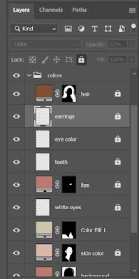
There were many layers in the making of this exercise.
Final
 |
| Fig 2.8: Project 2A Exercise 2 Part 2 #1 Final (6/10/2021) |
Part 2
Image + References
I had chosen this image of Cameron Boyce since I was a fan of his acting and I also love the composition of the photograph so much that I wanted to recolor it in my own way.
 |
| Fig 2.9: Black and White Photograph #2 (7/10/2021) |
 |
| Fig 3.0: Skin color and hair color reference (7/10/2021) |
 |
| Fig 3.1: Fleece clothes color reference (7/10/2021) |
Progress
It was actually a bit harder to work on a lower quality image but the tools learned during the tutorial really helped to solve that problem.


Comments
Post a Comment