Information Design / Exercises
Nurul Adlina Rizal / 0345429 / Bachelor of Design in Creative Media
Information Design
Exercises
LECTURES
Week 1:
4/1/2022
We were briefed on our Exercises and Assignments by Ms Anis. We worked on Exercise 1.
6/1/2022
Ms Anis gave us a lecture about Introduction to Information Visualization then we continued to work on Exercise 1.
Lecture Slides
Week 2:
11/1/2022
We conducted our first FLIP Classroom regarding Types of Infographics and continued doing Exercise 1.
13/1/2022
We conducted our second FLIP Classroom regarding Saul Wurman's L.A.T.C.H and started with Exercise 2.
INSTRUCTIONS
Exercises
Exercise 1: Quantify and Visualize Data
Idea Exploration
Sketches
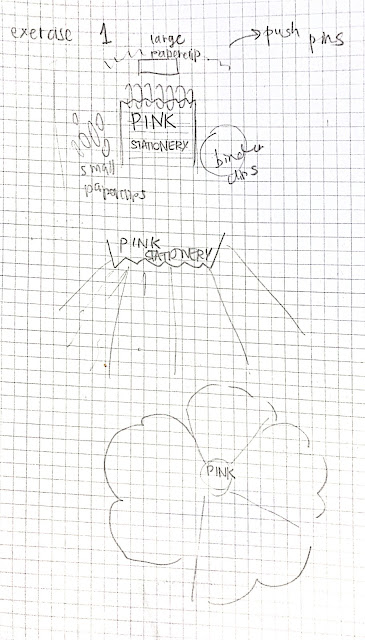 |
| Fig 1.0: Sketches (14/1/2022) |
I had three different layout ideas for my pink themed stationery.
Drafts

|
| Fig 1.1: Draft #1 (10/1/2022) |
In my first draft, I organized the data of my Legos in categories of color as well as the types - ones with two studs, ones with four studs as well as miscellaneous pieces. I initially wanted to create objects out of them, as I was inspired by the color to create a wave object from it but it was too difficult. I want to try it out on a 2D space instead of 3D.

|
| Fig 1.2: Draft #2 (10/1/2022) |
Since I was unable to come on campus, I did not have Legos at hand and instead looked at my collection of pink stationery. The composition of this is quite straightforward but I tried to add more visual interest by positioning all the objects towards the center to lead the viewer's eye.
Final
 |
| Fig 1.3: Final Exercise 1 (14/1/2022) |
I added the washi tape to add more variety to the arrangement.
RATIONALE
This is a collection of my pink stationery ranging from different sized paper clips to washi tape. I arranged them in a central arrangement where all the items revolve around the title 'Pink Stationery'. I arranged them in categories of what type of stationery they were and although they are grouped together they have a bit of an organic placement to replicate a messy table full of stationery. The tiny text in black are the labels of each category.
Exercise 2: L.A.T.C.H
Visual Research
I wanted to do something related to Avatar: The Last Airbender since
its something a series I love very much and am binge watching
currently.

|
| Fig 1.4: ATLA Map (13/1/2022) |

Fig 1.5: ATLA Elemental Symbols (13/1/2022)
Idea Exploration
My idea for this exercise is to do an infographics about the main
characters (possibly side characters) of ATLA and where they come from
and what elemental power they posses. I also want to stick with the
art style of the original that has an oriental theme / Asian
influences.
Sketch

|
| Fig 1.6: Sketch (13/1/2022) |
Basing it off map infographic, I pinpoint the places on the official Avatar: The Last Airbender map of where the characters are from.
Based on my research, map infographics are good at conveying information based on locations in a visual format. They are also easy to read, understand and engage with.
Draft
 |
| Fig 1.7: Draft (27/1/2022) |
The draft has all the elements of what I wanted but I was still not able to figure out the font and composition of the whole infographic.
Final

Fig 1.8: Final (28/1/2022)
RATIONALE
For the final, I added the extra information in a map legend showcasing which color part of the map is of what nation. Other than that, the emblems of each element which 4 of the main characters wield. I tried to kept in the same aesthetics from the original show which was the frames on the right and left. I decided to use the original title design as well since it is so easily recognizable.
In conclusion, I was able to use Saul Wurman's L.A.T.C.H's L which is location for this infographic.
FEEDBACKS
Week 1
General Feedback: -
Specific Feedback: -
Week 2
Specific Feedback: Looks alright but it does look a
little bit plain, try adding different pink colored stationery.
REFLECTIONS
Experience
The lectures in class were not only comfortable to be in, I clearly understood what was being taught through the slides. The FLIP Classroom as well was a good experience to participate and observe. Many of my classmates had interesting points in their presentation that I can learn from to help me for my future works in Information Design.
In Exercise 1, the items used were also fun to categorize and arrange such as Legos and buttons. Other than that, the atmosphere in both physical and online class were energetic despite how early classes are which is a great start to a short semester. Even though I got sick and was unable to keep using Legos the alternative was still a fun process.
In Exercise 2, I took a bit of time trying to do it because I was a bit stuck with the composition and color palette. It was still enjoyable and rewarding nonetheless.
Observation
In Exercise 1, when we had to use physical items to create an arrangement/layout, it really challenged my brain on how we had to fit all the items in one A4 space as well as organize it in a way where the viewer can see it and get the data being displayed. I observed that I was able to first look at things objectively first before turning it into something creative.
For Exercise 2, I observed that I tend to be a little discouraged when things do not go as I planned out but I should learn to trust the process and myself to try to reach my expectations. I also should not stress out if my work does not reach them.
Findings
I had learned to not depend on digital programs for the first exercise as well as ways to organize data and information in creative ways.
For Exercise 2, sometimes I find it best to keep looking at references and color palettes so I can keep myself inspired throughout the process. As well as not to be discouraged so easily in the midst of your design process.


Comments
Post a Comment